How does the trend editor work?
This article explains how you can use the trend editor in The Business Plan Shop's financial forecasting software.
How does the trend editor work?
Trend settings
The trend settings tab lets you enter the name and description of your new trend.
You can also select the type of trend you want to create depending on which dataset you want to use.
You can use actuals data that you've imported into the software, your financial forecast, or projected data (which is a combination of actuals and forecasted data) to create a trend.
Data settings
The data settings tab lets you configure the date range of the data that you’ve selected in the trends tab.
You can choose the data frequency as well as how many months in the past and future that you want to include.
Chart settings
The chart settings tab lets you configure both the x and y axis for your trend chart.
You can configure the axis steps, numerical format, and choose to add labels if you wish.
You can also decide what type of chart you want for your trend (column, bar, line, combo, area).
Series settings
The series settings tab lets you choose which datasets should be included in your chart.
You can use financial or non-financial data or KPIs.
Preview
The preview tab lets you visualise how your trend looks like in graphical form.
You should use this tab to see if there are any patterns in the trend that you’ve created.
Comments and notes section
The comments & notes tab lets you write notes on each page that may prove useful at a later stage.
These notes can be kept private or shared with other users that you have invited on your account.
Frequently Asked Questions
Creating trend analysis is an easy way to quickly gain insights on your business performance.
Plotting key metrics on a chart enables you to immediatly see in which direction you are headed and make adjustments if needed.
For example, are your revenues following a positive (upwards) trend?
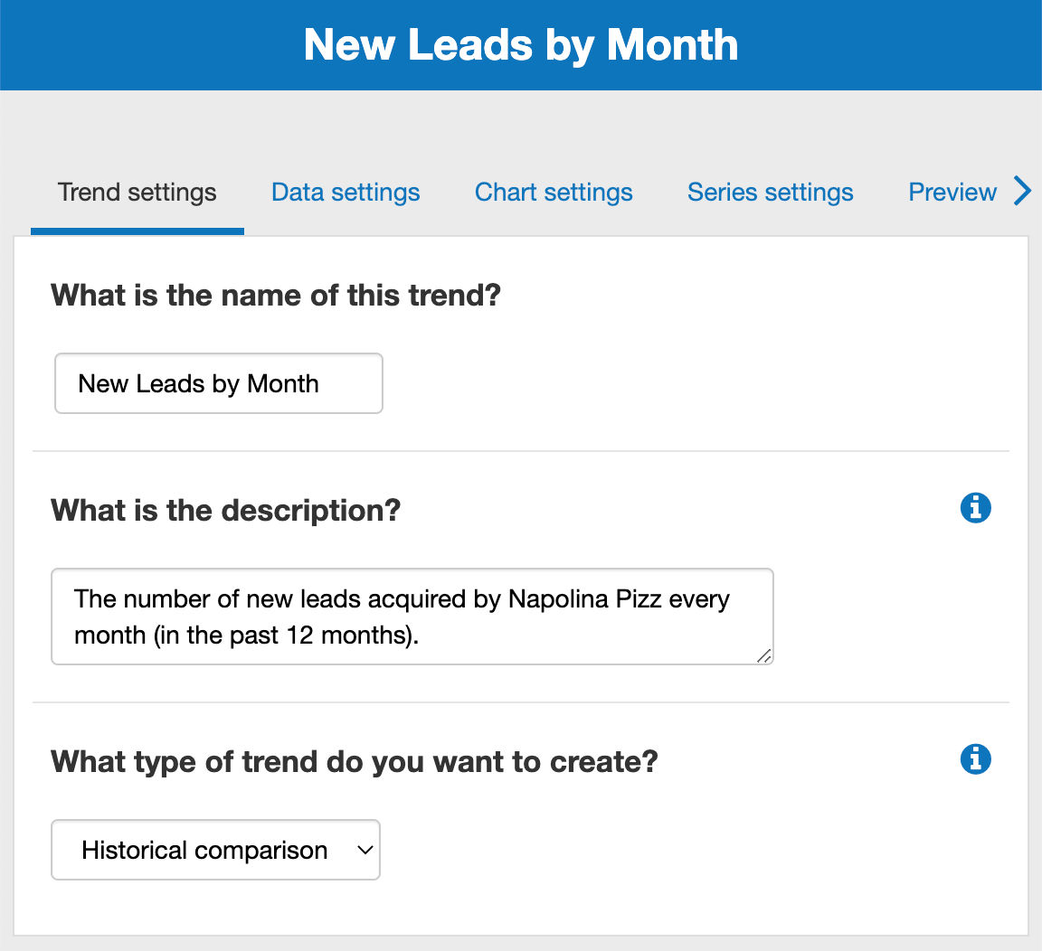
- Firstly, click on the trend settings tab at the top of this page
- Next, you’ll see a text box with the heading "What is the name of this trend?"
![changing the name of a trend in The Business Plan Shop]()
- Enter your chosen name into the text box given
- In this example, we’ve chosen new leads by month as the trend name.
- Finally, press the “save and close” button
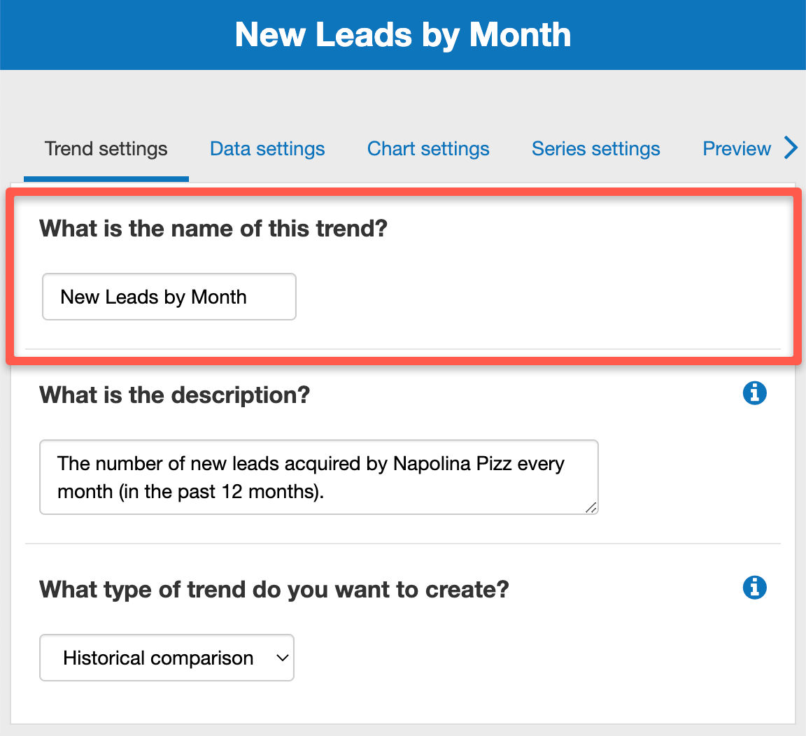
- Firstly, click on the Trend Settings tab at the top of this page
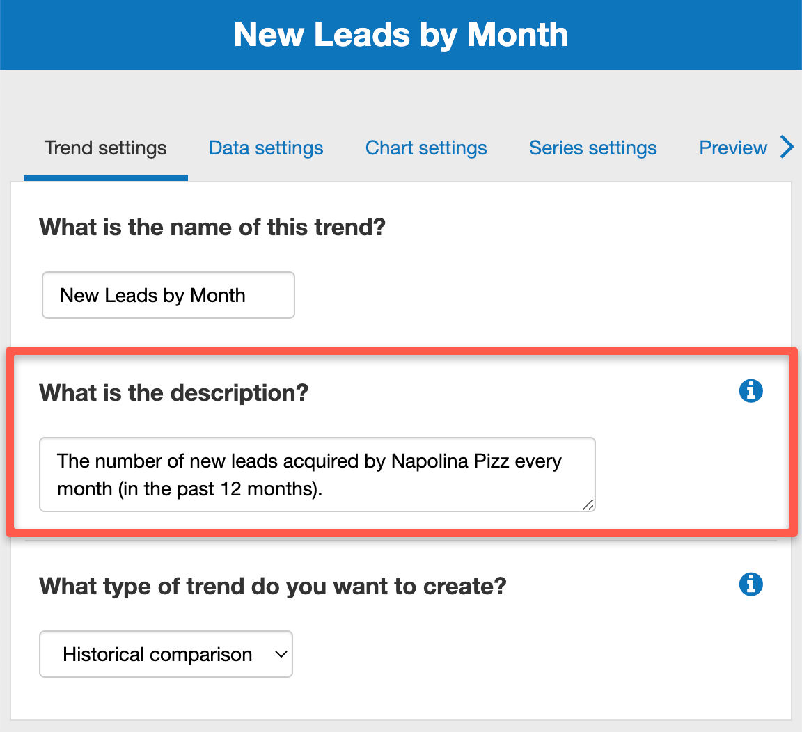
- Next, you’ll see a text box with the heading “What is the description?"
![adding a new trend description in The Business Plan Shop's online software]()
- Enter your chosen description into the text box given
- (In this example, we’ve chosen the number of new leads acquired by the business each month in the past year).
- Finally, press the “save and close” button
You can create three types of trend analysis - historical, forecast or projection
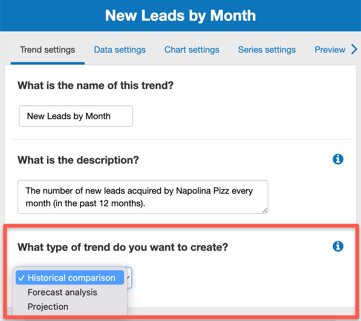
Historical comparison:
Enables you to compare data in the past. They are useful to compare the current year's actuals vs. forecast, or current year's actuals vs. last year's actuals. Note to compare against the previous year, you will need to first create a KPI using the previous year as range).
Forecast analysis:
Enables you to visualize future data. They are useful if you want to deep dive on a given forecast, or compare multiple forecasts (base case vs. worst case for example).
Projection:
Enables you to visualize past and future data on a single chart. We use your actuals data for periods in the past and combine them with future data from the selected forecast.
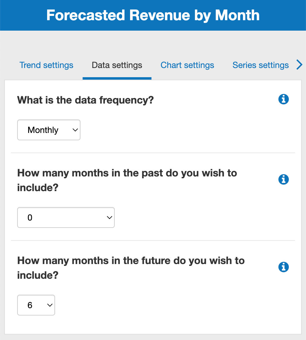
- Firstly, click on the Data Settings tab at the top of this page
- Next, you’ll see a text box with the headings “How many months in the past do you wish to include?" and “How many months in the future do you wish to include?”
![choosing the date range for a trends in The Business Plan Shop]()
- Enter the number of months that you wish to create a trend for in one of these
- Depending on what type of data you’ve picked (historical, forecast, projection)
- Finally, press the “save and close” button
- Click on the "chart settings" tab at the top of the page
- Use these options to configure your chart and the legend position.
![configuring a chart in terms of the type, legend and axis label in The Business Plan Shop]()

Chart type
Choose the type of chart you want to resemble your data (column, bar, line, combo, area).
Legend
Top, bottom or none - choosing none will mean your chart won't have a legend.
Main axis label
The label that will be shown on the horizontal axis of the chart.
- Click on the "chart settings" tab at the top of the page
- Use these settings to configure your chart axis
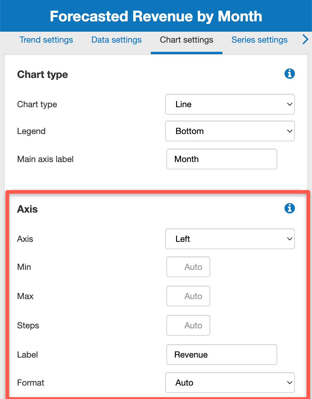
Use these options to configure the left axis (and optional right axis). You can also leave the fields blank to use the automatic values.
The steps field corresponds to the number of grid lines on the axis (for example if the min is 0, the max 100, and the steps are 3: the grid lines for the axis will be 0, 50, 100).
A series is a set of data for either a financial metric, non financial metric or KPI which you want to plot on a chart in order to analyse its past or future performance.
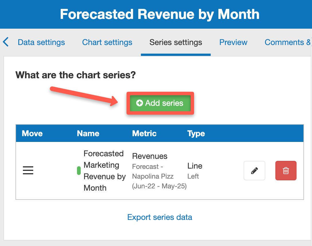
- Firstly, click on the Series Settings tab at the top of this page
- Next, you’ll see a header with the title “What are the chart series?”
![adding a new series in The Business Plan Shop]()
- Click on the add series button below
- You’ll now be able to enter the name of the series
- You should also choose what type of data that series follows (financial or non-financial data) and select an individual metric
- Finally, press the “save” button
- Firstly, click on the Series Settings tab at the top of this page
- Next, choose which series that you want to edit
![editing a trend series in The Business Plan Shop]()
- Click on the edit button
- You'll now be able to edit your series
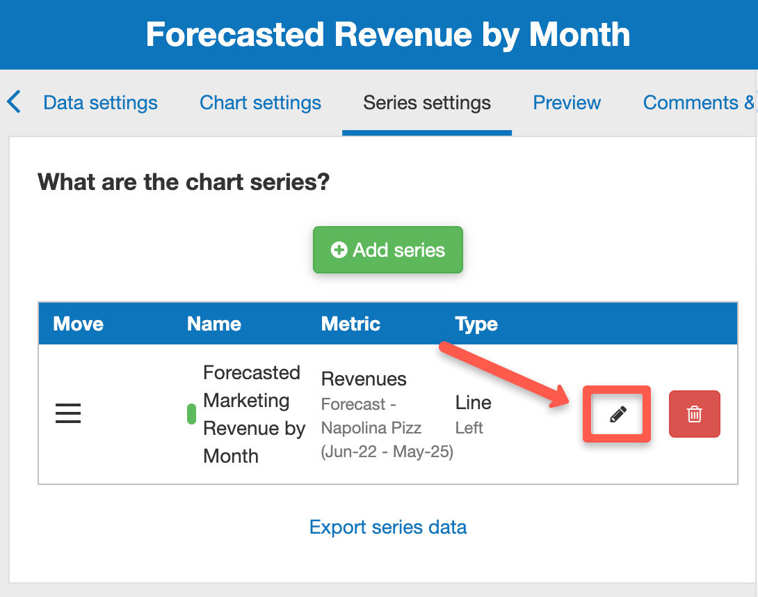
While editing a series, you'll have a number of options that you can choose from:
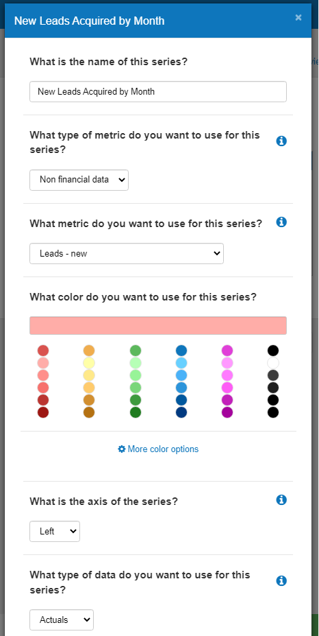
What is the name of this series?
Enter the name of the series (will show on the chart).
What type of metric do you want to use for this series?
Choose either financial, non-financial, or KPI data depending on what trend you want to create.
What metric do you want to use for this series?
Choose the corresponding metric (for example revenues or new leads).
What color do you want to use for this series?
Choose the colour that you want that set of data to represent on the chart.
What is the axis of the series?
Choose which side of the graph you want your series to be placed in (if you only have one series, by default it will be left).
What type of data do you want to use for this series?
Choose whether your trend follows historical (actuals) or forecasted data (non-financial data will always be actuals, while financial data could be either).
- Firstly, click on the Series Settings tab at the top of this page
- Next, choose which series that you want to delete
![deleting a series in The Business Plan Shop]()
- Click on the delete button
- You'll get a confirmation message
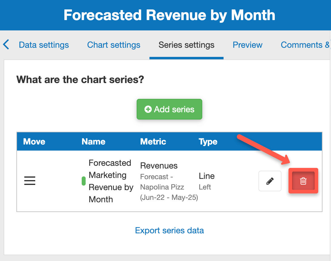
No, you cannot restore a deleted series so be sure to think twice before deleting.
- You can reorder series by dragging and dropping them inside the table
- Click on the drag handle at the beginning of the row reordering series by dragging and dropping
![dragging and dropping the hamburger icon to reorder series in the trend editor in The Business Plan Shop]()
- Click and hold on the icon simultaneously, while dragging it to your chosen location in the table
- The series should now be placed in your desired position in the table

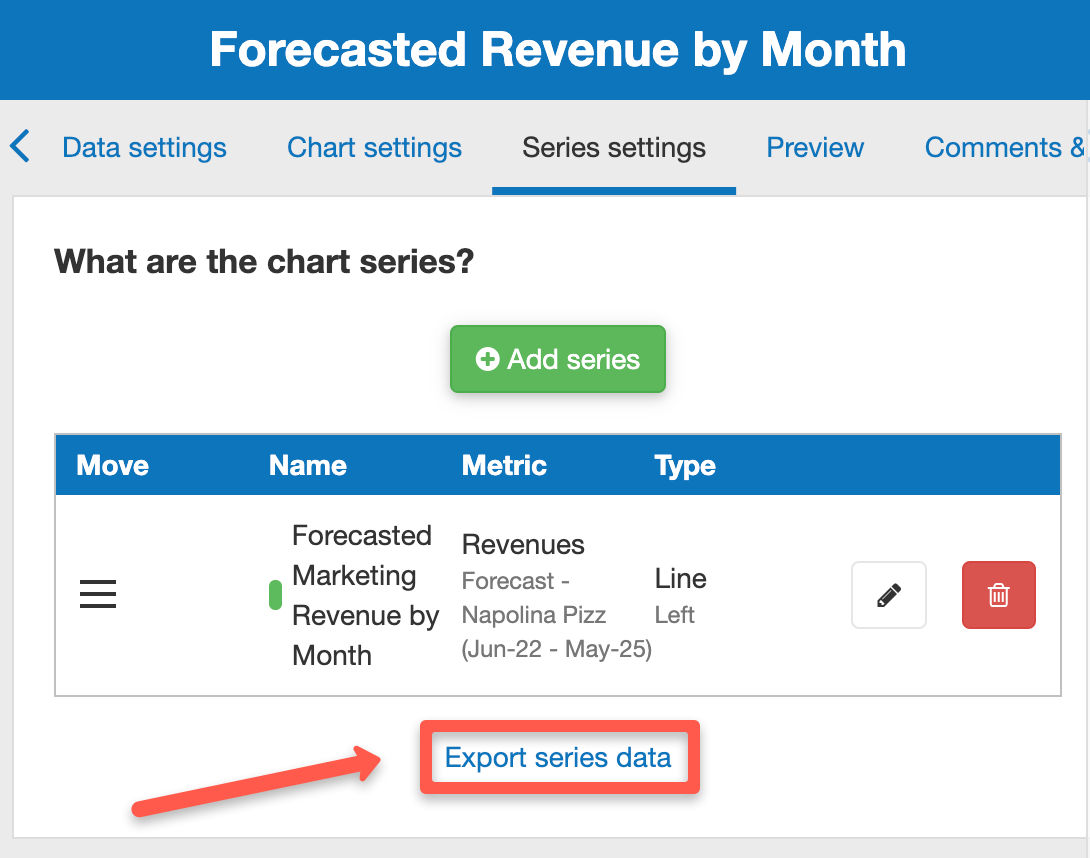
- Firstly, click on the Series Settings tab at the top of this page
- Next, click on “export series data” beneath the table
![exporting my trend series data as a CSV file in The Business Plan Shop]()
Go further with The Business Plan Shop
Was this page helpful?